
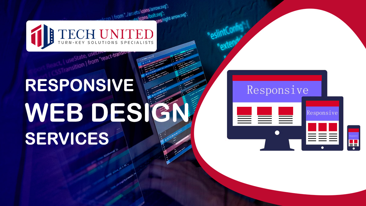
A website is designed using the responsive web design method to offer the best viewing experience on a variety of devices. Regardless of whether a person is accessing a website on a tablet or smartphone, responsively designed websites offer improved user experiences.
Responsive Web Design Services for Startups and enterprises
Responsive web design is a method of web design and development that seeks to create websites that adapt and respond to the user's device and screen size. Because more and more people are accessing the internet through mobile devices like smartphones and tablets, it is imperative that websites provide the greatest viewing experience possible across a range of technologies and sizes of screens.
Creating a fluid and adaptable style that dynamically rearranges and resizes text, photos, and other components to match various screen sizes is the main objective of responsive web design. With responsive design, a single website can be developed that can easily adjust to numerous devices, ranging from desktop computers to smartphones, saving the effort and expense of developing individual websites or mobile applications for each device.
Fluid images, CSS media queries, and adaptable grid systems are frequently used in responsive web design. Flexible grid systems enable dynamic resizing and rearranging of the website's parts by defining the layout using relative units such as percentages rather than fixed pixel values. Fluid pictures don't overflow or look too tiny on various devices since they scale proportionately to suit their containers.
Using CSS media queries, alternative styles or rules may be applied depending on the features of the device being used to view the page. Developers may customize the user experience for various scenarios by using these queries, which can target certain screen sizes, resolutions, orientations (portrait or landscape), and even device capabilities.
By implementing responsive web design, websites can provide an optimized browsing experience, regardless of the device or screen size being used. Users can easily navigate, read content, and interact with the website, without having to constantly zoom in or scroll horizontally. It also simplifies the development and maintenance process, as changes and updates only need to be made once for all devices, reducing time and cost.
In conclusion, responsive web design is an approach to web design that makes sure websites adjust and react to various screen sizes and devices. It streamlines development and maintenance procedures and increases accessibility and user experience.